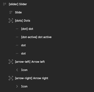
The nav menu must have the following structure and use the tags that indicate the slider sections.

[dots] is the pagination and container for the [dot] elements. It must be created with auto layout because it will be used to determine the gap, padding, background, border, and position to the slider, as Bricks Builder does.
[dot] and [dot-active] are rectangles. Fancy Figma will take their properties, such as size, background, and border, for the Bricks slider.
[arrow-left] and [arrow-right] are containers with auto layout, from which properties such as size, background, border, and position will be taken. Inside them are vectors, Fancy Figma will take their size and fill for the icon styles in Bricks builder, so make sure it is a solid vector.
You can work with the slide element however you want using auto layout.
If you are going to use the class workflow, just add the class to the main element: [slider] my-slider {slider-class}. You should not add classes to dots or arrow elements.
PS: In the figma file you will find this ready-made structure that will save you time.